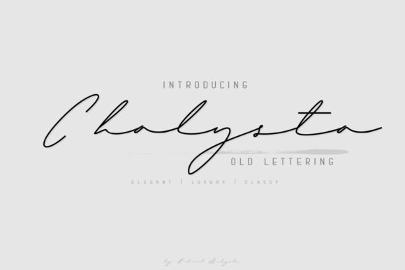
Chalysta: A Web Designer's Review of This Flowing Handwritten Font
I was refreshing a landing page for a boutique online store when I realized the hero section needed something more personal. The brand was built around handmade ceramics, and the current headline used a clean sans serif that felt too corporate. I pulled up my font library and tested Chalysta for the first time. Within seconds, the header transformed from standard to intimate. The thin, flowing strokes of this handwritten font brought a warmth that no generic typeface could match. As someone who spends hours tweaking typography for digital brand experiences, I knew immediately that this script font deserved a closer look in real web layouts.
First Impressions: Bringing Digital Warmth to a Landing Page
Chalysta is a thin, exquisite handwritten font that carries a natural sense of motion. When I placed it over a soft beige background with a ceramic product image, the headline read like a personal note from the maker. The letters are light, airy, and connected in a way that feels organic without being messy. For web designers working on brand identities that need a crafted touch, this typeface offers an immediate shift in mood. It is sophisticated enough for premium brands yet approachable enough for creative small businesses. The first thing I noticed was how well it sat on screen—no awkward spacing, no broken connections, just a smooth, elegant flow that draws the eye naturally.
In digital design, first impressions happen in milliseconds. A hero section with Chalysta invites visitors to slow down and read. That is exactly what you want when selling handmade goods, coaching services, or creative course content. The font commands attention without shouting. It whispers quality, care, and intention. For any web designer seeking to build emotional resonance from the first scroll, this is a strong candidate.
Testing Chalysta in Hero Sections and Headlines
The most natural place for a decorative handwritten font like Chalysta is in hero titles and section headings. I tested it on a coaching website where the main headline read, "Design a Life You Love." At larger sizes, the thin strokes remained crisp and readable. The ligatures and natural letter connections added a bespoke feel that made the headline look like custom lettering. I paired it with a clean sans serif for the subtitle and body copy, and the contrast was immediately effective.
For a product landing page for a line of organic skincare, I used Chalysta for the main category headers—"Cleanse," "Nourish," "Protect"—and the result was elegant without being fussy. The font works beautifully for short phrases, names, and decorative titles. It is not designed for long paragraphs or dense information, but as a display font for key moments, it outperforms many script options I have tested. The thin weight means it performs best on light backgrounds or with careful contrast on dark ones. When I tested it over a product photo, I added a subtle text shadow to maintain readability. That small adjustment made all the difference.
Responsive Design and Mobile Readability
Every web designer knows that a font that looks stunning on desktop can fall apart on mobile. I tested Chalysta across breakpoints from 320px to 1440px. At mobile sizes, the thin strokes still held together well for headlines. I recommend using it at minimum 24px for headings and ensuring sufficient contrast. On small screens, the font retains its charm without becoming illegible, but it is best reserved for short, impactful text rather than navigation or button labels. For buttons, I switched to a simple sans serif to maintain clarity and accessibility.
One thing that impressed me was how the font handled responsive scaling. The letterforms stayed balanced, and the natural rhythm of the script did not distort at smaller sizes. I tested it on an iPhone 13 and a Samsung Galaxy, and the reading experience was consistent. For a boutique online store, I used Chalysta in the top banner and product category titles on mobile. The look remained premium and intentional. That kind of reliability is rare in decorative handwritten fonts, and it makes Chalysta a practical choice for real web projects where responsive performance is non-negotiable.
Font Pairing: Building a Cohesive Digital Brand Identity
Chalysta shines brightest when paired with a complementary body font. In my tests, I used a simple sans serif like Montserrat or Open Sans for body copy, navigation, and secondary text. The contrast between a structured sans serif and the flowing script creates a clear visual hierarchy. Visitors instinctively know where to look first. The headline draws them in, and the body text delivers the message without competition.
I also experimented with a light serif for editorial-style layouts, and the combination worked beautifully for blog headers and about pages. The key is to let Chalysta lead the visual story while keeping everything else clean and minimal. Overloading a page with multiple decorative fonts would dilute its impact. One strong headline with Chalysta, supported by a neutral body font, is a formula that consistently delivers a polished, trustworthy brand presence. For web designers building digital brand kits, this pairing strategy ensures consistency across landing pages, product pages, and even email headers.
Where Chalysta Excels in Digital Design
This font is ideal for hero section titles, landing page headers, call-to-action phrases, blog post titles, decorative quotes, online shop banners, and digital ad creative. I also used it for logo text in a mock brand kit, and the result looked like custom lettering. For campaign landing pages where emotional tone is critical, Chalysta delivers a warm, human touch that standard fonts cannot replicate. It also works well in PDF lead magnets, course slide headers, and social media graphics where a crafted feel is desired.
However, I would not recommend Chalysta for long body copy, small navigation links, form labels, footer text, or any interface element that requires dense information or accessibility compliance. Its thin strokes and decorative nature make it less suitable for small sizes or complex data displays. For dashboards, legal pages, or product specifications, stick with a robust sans serif. Knowing where not to use a font is just as important as knowing where it shines, and Chalysta is best reserved for moments that need personality, not utility.
File Formats, Licensing, and Webfont Readiness
Before committing to any font for a client project, I always check the included styles and licensing. Chalysta comes in standard formats that work well for web use, but I recommend confirming webfont availability and checking for alternate characters, ligatures, and swashes. These design assets can elevate a headline from standard to exceptional when used intentionally. If you plan to use the font on websites, client projects, online stores, landing pages, or digital templates, verify the commercial font licensing covers your specific use case. The last thing any designer wants is to build a brand around a font that cannot be used commercially or on the web.
I also recommend testing the font in your actual layout tool—whether that is Figma, Webflow, Shopify, Squarespace, or a custom CMS. Previewing it at real sizes and on real content is the only way to be sure it performs as expected. In my own workflow, I test every font across three devices and two browsers before finalizing the typography system. Chalysta passed those tests with ease for headings and display use. Its lightweight character adds elegance without sacrificing performance.
For web designers who value both beauty and practicality, Chalysta offers a rare combination of emotional warmth and digital reliability. It is a premium font that elevates brand identity without complicating the layout. Whether you are designing for a creative entrepreneur, a boutique shop, or a personal brand, this handwritten typeface brings a personal touch that resonates with today's audiences. When used thoughtfully—paired with a clean sans serif, reserved for key moments, and tested on mobile—it becomes a powerful tool in your digital design toolkit.